
My thoughts on Ancho
Ancho is a blocky, stepped looking, sans-serif display typeface by Beatriz Lozano. She said it’s inspired by Mexican cuisine and the architecture of Teotihuacán. I can definitely feel that vibe. The free font also comes as variable font, providing you with a lot of additional steps in weight. Due to the striking design and given that Ancho is upper-case only, it’s a cool choice for headings, a large title, or maybe a short lead-in paragraph. Don’t use it for body text or functional text.
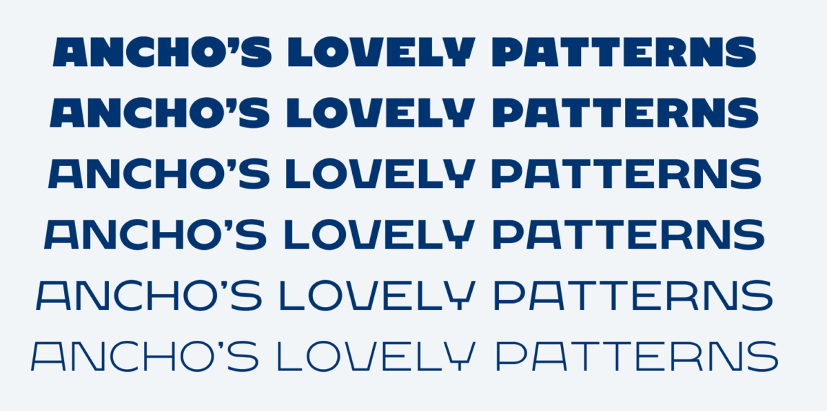
I love what rhythmical patterns can be created when mixing extreme weights like Light and Ultra Bold. One particularly cool thing is, that the letters almost keep their width throughout the different weights. The lighter, the edgier it looks. Some letters in the lighter weights are quite awkward, almost ugly to me, like the W, but as a whole, it creates super-interesting patterns.
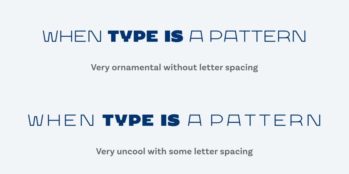
With Ancho, type becomes more ornamental, so it works better when breaking the rule of properly spacing out all caps text. In the example above, when you add letter spacing to it, it looses its integrity, the individual letters get too much attention, appear even weirder, and gone is the lovely contrast. Ancho shows you how it always depends on what you do with those letter shapes.
Recommended Font Pairing
What would pair well for body text with Ancho? Since this typeface is very well-defined in its role as a display font, you can pair it with whatever font you think fits the mood of your project. But if you need some inspiration, quirky and narrow Right Grotesk would make a contrasting combination, but also geometric Outfit is a good combination.

- Headings


Learn more about pairing typefaces using the Font Matrix.