
My thoughts on Arpona Sans
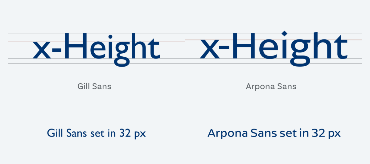
I often complain about Gill Sans, and don’t get me wrong, it’s a good typeface for it’s time (which was 1928). For nowadays usage in digital applications in small sizes the tiny x-height of Gill Sans is problematic for legibility. That’s where Arpona Sans by Felix Braden come into play. It conveys that vibe of a friendly, approachable, very British sans-serif but performs excellent in smaller sizes. I love how restrained the upright seems, and yet how much temperament lies in the expressive italic. Gee, look at that the diamond shaped dots! Also, Felix is just the nicest guy ever, so these are all good reasons to buy this typeface or activate it on Adobe Fonts.
One caveat though – Arpona Sans is rather wide, which means for body text on mobile you might even set it slightly smaller than the 17 px I set it in the smartphone example above. Also check out Arpona, the serif companion of Arpona Sans. The serifs are pretty subtle and they make a perfect match. Is Arpona Sans the contemporary Gill Sans for your next project? Write it in the comments blow!
Recommended Font Pairing
For interesting and playful headings, combine Arpona Sans with playful the confident slab serif typeface BioRhyme.

- Headings
- Copy
- UI Text

Learn more about pairing typefaces using the Font Matrix.
To be honest, Oliver, I won’t use Arpona except if I see it’s fit in some project. It’s suitable for architecture-construction-ist industries and a diamond dot is just marvelous. However, it’s not my personal style. I’m a Gemini (not that I believe in Zodiac) but if I tell you that I love fashionable LeMondeLivre, Dosis and Avenir Next, and Josephin Sans… What would you think of me? Thanks for sharing this new creature, but I enjoy more narrow letters!
Hey Jana, thanks for sharing your thoughts! I agree with you that the personality and taste of the typographer always has a huge influence on the type choice. One thing not to forget though is if it fits the theme of the project and the practical application.
Le Monde Livre is beautiful! Thanks for sharing it!