
My thoughts on Mont Blanc
Mont Blanc is a geometric sans serif published by Fontfabric. I like the warm and a bit retro-looking design, giving you the feeling of the early rise of tourism in the middle of the past Century. Maybe this comes to me because of the name?
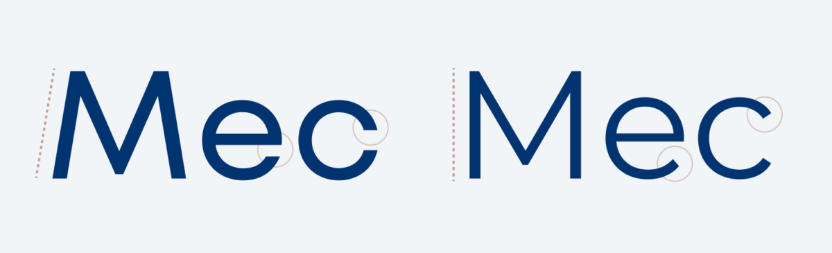
Anyway, Mont Blanc is made for body text and headlines. It definitely needs some space, since it’s a pretty wide design. This will be beneficial for broader columns in desktop layouts. If you primarily focus on mobile you might consider looking for a slightly narrower alternative that fits more characters into one line. For functional text it’s an edge case. Yes, Fontfabric took the time to make it sturdier and more legible than it’s successor Mont, but still it becomes blurry very smaller sizes due to its very closed shapes. This is also the reason why I would not use it for super text heavy long reading applications.
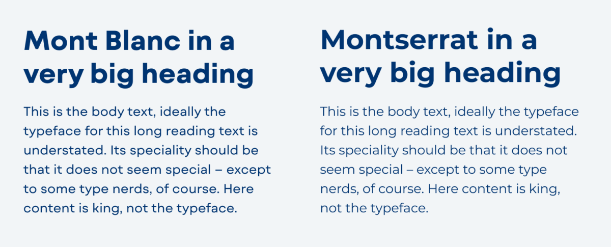
When thinking about similar and popular Google Fonts, Montserrat is the typeface that comes to my mind. If you compare them, they are quite similar at first sight, but with Mont Blanc the overall mood is more geometric and restrained. This is due to its closed shapes and sturdier stokes. Notice the difference in the appeared weight of both regular styles above. This makes it obvious that the named weights are not universal, and you might have to adjust them.
Montserrat is a wonderful typeface with a lot of weights and styles, but with everything that’s good and free, it is super wide spread on the web. So Mont Blanc could be a good alternative if you are looking for something close that has a little more uniqueness or even quirkiness.
Recommended Font Pairing
To make this font a bit less rational and sober, pair it with something playful, like soft and rounded Sniglet.

- Headings
- Copy
- UI Text

Learn more about pairing typefaces using the Font Matrix.