With variable fonts, more typographic richness and influence is coming to the web and this at a relatively low file size. You want to benefit from that in your next web project, but still, you don’t want to bet everything on this new technique? This article will show you how to integrate a variable font in your website and use classic web fonts as a fallback.
Quick intro and why to use a fallback
If you are new to the subject of variable fonts, you mighwet want to read How to start with variable fonts on the web that covers all the basics and come back later. But to give you a very brief introduction: traditional (static) web fonts, as we know them, store one style in one individual file; one for regular, one for bold, one for italic and so on. With a variable font, you can store and create several styles using one single font file. This brings more typographic flexibility and might also come at a lower file size. The website v-fonts.com is a great place to find available variable fonts. Some of them are for free and some are commercial. The free ones almost always offer free static web fonts too (e.g. Source Sans Variable and the non-variable Source Sans). Almost all commercial variable fonts can only be purchased as an add-on if you buy the whole family (of static fonts), so you get them anyway.

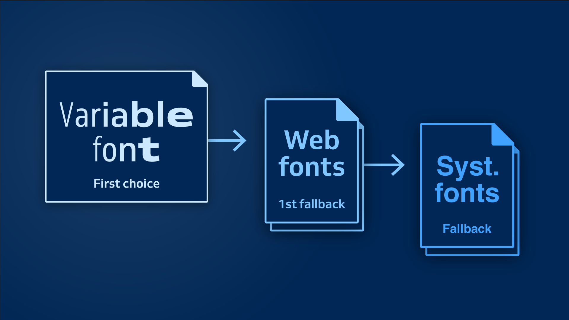
Variable fonts are now supported by all modern major browsers (October 2018). But what if someone uses an older browser? They would see system fonts as a fallback. This all-or-nothing approach might be too radical for most projects. It compromises the whole typographic voice and uniqueness of a site for everyone who does not use the most recent browser version. Using static web fonts of the same font family as the first fallback option would be the preferable way. If the variable font is supported it should be displayed, if not, the static, non-variable web font should be shown.
The setup
Let’s do a step by step example where you can see how to implement a variable font with fallback web fonts. For this, I made a little test site with some text on it. I’ll keep it very basic for this example and only use a h1 and two p with some strong text in it.

For this example I choose the variable font Venn by Dalton Maag, which has two axes:
- a weight axis with a range of 300 to 800 and
- a width axis with a range of 75 to 125.
With this you can create a lot of styles, going from Light Condensed to Extra Bold Expanded and everything in between.

If the browser supports the font variations, let’s benefit from this range of widths. Our goal for this example is, that the text should become narrower on small screens to fit more words into one line. On large screens, the text can be wider to distribute more evenly throughout the given space. If the browser does not support the variable font, it should replace it with the static web fonts for Venn Regular and Bold. In this case, the width won’t change.
1. Load the fonts
At first, we have to load the different fonts we need:
Venn_VF.woff2is the variable font fileVenn_Regular.woff2as a fallbackVenn_Bold.woff2as a fallback
Integrating a variable font by using the @font-face rule is very straightforward, as you can read here. I give the variable font a different name than the static font to make it distinguishable, and will call it Venn VF. This is how I load it:
@font-face {
 font-family: 'Venn VF';
 src: url('Venn_VF.woff2') format('woff2-variations'),
      /* will be the standard and works in Safari now */
      url('Venn_VF.woff2') format('woff2');
      /* for the other supporting browsers */
}
Now I load the static fallback fonts for the regular and bold style and name it Venn:
@font-face {
 font-family: 'Venn';
 src: url('Venn_Regular.woff2') format('woff2');
}
@font-face {
 font-family: 'Venn';
 src: url('Venn_Bold.woff2') format('woff2');
 font-weight: 700;
}
But wait a minute – won’t the browser download all the fonts now, the variable and the static ones? No, it will not. “A web font is only downloaded when it is used in a CSS selector that matches a DOM connected node” I learned in Bram Stein’s talk about web fonts performance. So modern browsers only download a font when it is needed to display something on a page. For our example, this means the browser won’t download any of the font files for now because we have not styled anything with it yet. Let’s do this next.
2. Style the text with the fallback fonts
A variable font is a progressive enhancement for your typography, so see it as an optional improvement. This means we have to create a solid basis first by styling the site with the static web fonts:
body {
 font-family: 'Venn', sans-serif;
}
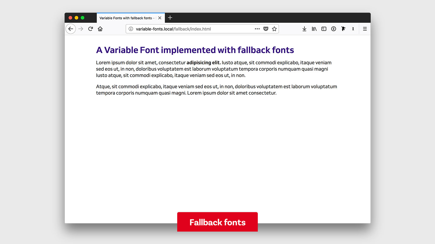
To write a really robust font stack you should also add some system fonts, but I’ll keep it simple, for this example (find out more about this in my German article about the CSS font stack). This is how my site looks now showing the static web fonts:
Now you might think why not writing the font stack this way:
body {
 font-family: 'Venn VF', 'Venn', sans-serif;
}
At first glance, this makes perfect sense. If the browser does not support or understand the variable font, it will move on to the static web font. The problem is, that some browsers unnecessarily download all the font files if you write the font stack this way. The most current browsers (Safari 12, iOS Safari 11.4 and Chrome 69) did not download the static fonts, but Firefox 62 did. All of them support variable fonts and should only download the fonts they need. On the other hand Edge 16 (an older version which does not support variable fonts) downloaded the variable font. So how can I get my browser to only download the fonts it needs? Find the answer to this in the next step.
3. Use CSS feature queries
All the browsers that support variable fonts also support CSS feature queries. You can check if variable fonts will work in the browser and only then apply certain styling. The feature query looks like this:
@supports (font-variation-settings: normal) {
 …
}
I only want to style my text with the variable font if the browser supports it. This means writing another font-family declaration inside a feature query. I put it after the first one so it will override the fallback styling. Now our code looks like this:
body {
 font-family: 'Venn', sans-serif;
}

@supports (font-variation-settings: normal) {
 body {
  font-family: 'Venn VF', sans-serif;
 }
}
@supports is the secret ingredient that makes it possible to style things differently when variable fonts work in the browser. Now Firefox 62 will only download variable font and Edge 16 will only download the static fonts.
4. Add styling for the variable font
In the next step, we will tweak the typography in our example. We start mobile first and go upwards towards bigger screens.
Base styling and small screens
We defined the font-family in the body, now let’s start styling the fallback web font first to have a typographic foundation. To keep it simple I only focus on the very basic typographic settings here:
h1 {
 font-size: 1.8rem;
 line-height: 1.1;
}

p {
 font-size: 1.1rem;
 line-height: 1.5;
}
Now let’s add some styling for the variable font where we change the width of the heading and the paragraph:
h1 {
 font-size: 1.8rem;
 line-height: 1.1;
 font-variation-settings: "wdth" 75;
}

p {
 font-size: 1.1rem;
 line-height: 1.5;
 font-variation-settings: "wdth" 88;
}
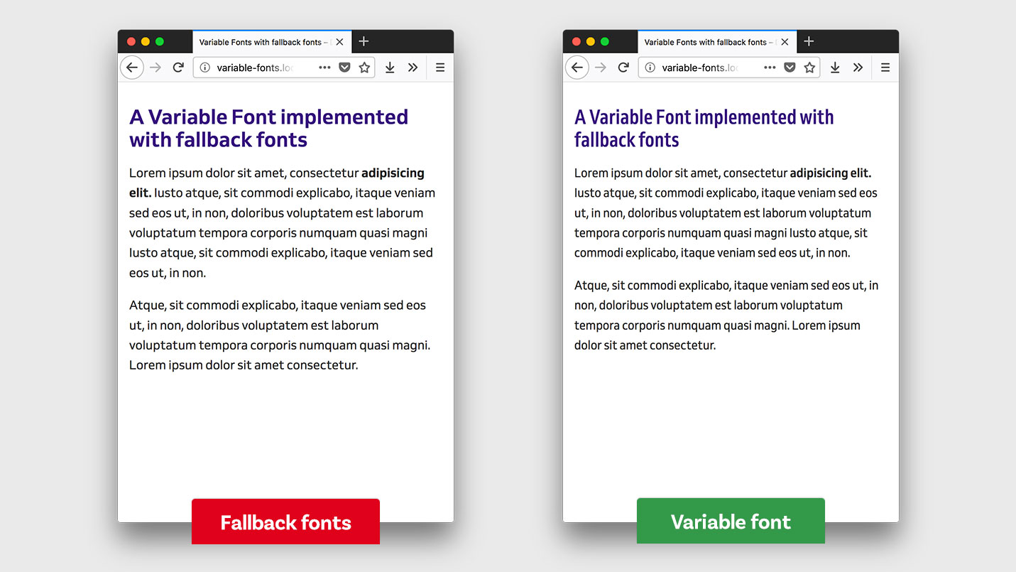
From now on we don’t need a feature query, because browsers that don’t get the font variation will just ignore it. You would need a feature query if you want to adapt the font-size or any other typographic setting only for the variable font, that an older browsers would understand. Depending on the capabilities of the browser our site will look like this:

Medium screens
The next breakpoint might be a large phone for example. I’ll add a media query and since the screen is wider now, I want to increase the line-height of the paragraphs:
@media screen and (min-width: 460px) and (max-width: 699px) {
 p {
  line-height: 1.6;
 }
}
Because I have more space now, the heading and the paragraphs can become a bit wider than on the smallest screen. I’ll change the settings of the variable font for the h1 and p:
@media screen and (min-width: 460px) and (max-width: 699px) {
 h1 {
  font-variation-settings: "wdth" 85;
 }
 p {
  line-height: 1.6;
  font-variation-settings: "wdth" 95;
 }
}
This result in:
Larger screens
Now let’s go for our last breakpoint in this example, wider screens of 700 px and above. Here I want to bump up the font size of the text and add even more line height to the paragraphs. I’ll put this into another media query:
@media screen and (min-width: 700px) {
 h1 {
  font-size: 2.5rem;
 }
 p {
  font-size: 1.2rem;
  line-height: 1.7;
 }
}

For the variable font I want the paragraphs to be at 100% width (like the fallback font) the h1 should still be a bit condensed to be more compact. Again I add the font-variation-settings to the h1 and p selectors inside the media query:
@media screen and (min-width: 700px) {
 h1 {
  font-size: 2.5rem;
  font-variation-settings: "wdth" 90;
 }
 p {
  font-size: 1.2rem;
  line-height: 1.7;
  font-variation-settings: "wdth" 100;
 }
}

That’s it. In classic CSS it looks pretty complex, but of course, you could easily write more clear code by using SCSS or another preprocessor. There is only one tiny optimization left to do.
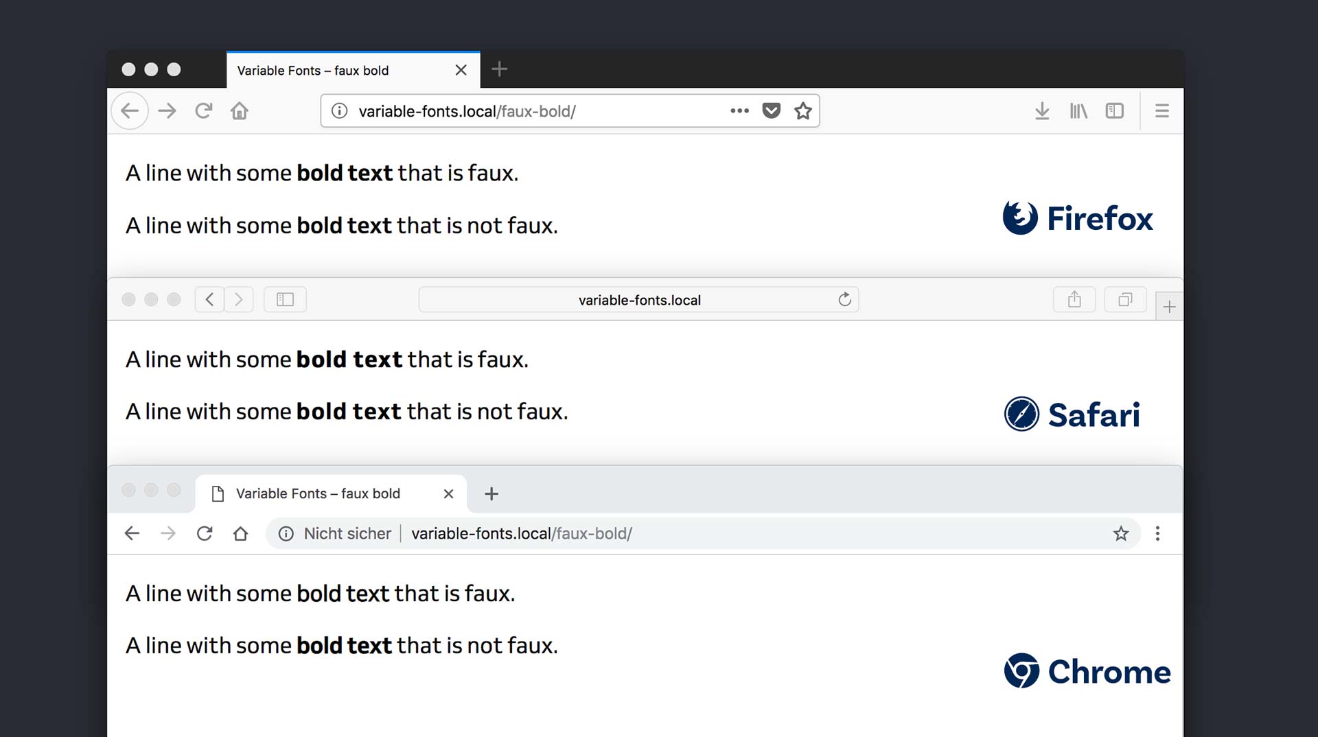
5. Prevent artificial browser styles
This is an error that unfortunately occurs in most browsers at the moment when user agent styling and variable fonts come together. Then most browsers don’t access the weight axis of the variable font and create a faux bold. Depending on the browser this will result in a sometimes bold-but-not-enough or too-bold-bold.
One solution is declaring the range of the weight within the @font-face rule:
@font-face {
 font-family: "Venn VF";
 src: …
 font-weight: 300 800;
}
This will help Safari to know that the variable font contains the weight it needs for bold text, used on strong or h1 to h6 by the user agent default styling. Sadly Chrome and Firefox do not get it and won’t access the weight axis of the variable font. So for them, you have to define the exact weight:
h1, strong {
 font-variation-settings: "wght" 700;
 font-weight: 700;
}
Why writing the font-variation-settings and font-weight? For some reason Chrome won’t make the text bold when using only the high level property font-weight. This seems rather stupid and redundant, but that’s the way it is right now. Eventually it will be fixed, but for now, this is an important step because faux bolding can look very problematic in some browsers as you have seen in the example before.
And to make it even more complicated, you can only define font-variation-settings once. The last time you write it, overrides everything you wrote before. So if you want to change the weight and the width you will have to write this:
strong {
 font-variation-settings: "wght" 700, "wdth" 88;
}
Update 5 November 2018: Laurence Penney pointed out to me that it actually does work in Chrome and Firefox when you add the weight range within the @font-face rule. I did some testing and confim that. Firefox does not require the range, Chrome and Safari do. So the changes describe above are not necessary.
Summing it up
Adding a web font as a fallback for the variable font is not that complicated and makes a lot of sense if you don’t want to lose the whole typographic experience of a website to every browser where font variations are not supported. The typographic system of the website should be as solid as possible with the fallback web fonts. Then add the variable font styling on top. Maybe you want to use a feature query for that, if it effects some styling that would change the fallback font too. But if it’s only the font-variation-settings, the a browser that does not understand it will ignore it. I prepared this example on CodePen where I added a toggle so you can compare the site with the fallback fonts and the web font. I also commented the code, so you can take a closer look.
See the Pen Using a variable font with fallback fonts by Oliver (@glyphe) on CodePen.
Any suggestions? All the things I wrote about here I found out by doing some tests in different browsers. If you observed some other behavior, spotted an error or have different approaches, write it in the comments below or hit me up on Twitter!
Great write-up and nice to see that variable fonts are gaining traction.
I was wondering if you’ve given thought to the issue of the width not being adapted with the fallback fonts in your example. Obviously we’d like Edge 16 to show the condensed version of the font so that styling is as consistent with the brand identity as possible. Is it possible to set it up that way?
Thank you, glad you liked my article. You could set it up that way, you would need a static version of the condensed font and use it at a certain browser width. In that case you would style something like this:
p { font-family: 'Venn Semi Condensed'; } @media screen and (min-width: 700px) { p { font-family: 'Venn', sans-serif; } }Hey Oliver, thanks for sharing your knowlage with us. I have one question regarding your @supports solution. Are browsers, which supporting variable font faces, downloading the static font fallback, too?
Best Philip
Hi Philip,
that’s a good question. It tested it with the most current versions of Safari, Safari iOs, Chrome, Firefox and Edge (all browsers that support variable fonts they only downloaded the variable font file, not the static fonts. But only when you use a feature query like I described it in point 3. Otherwise Firefox will download the static fonts as well.
Thank you for this great write-up. It removes the risks of using variable fonts. 🙂
very surprised to see no mention of the `font-display` property here
That’s a good point and you are right,
font-displayis not mentioned in the article. I wanted to keep it focused on the part of using the variable and static web font, but you can findfont-display: fallback;for the variable font and the static fonts in the CodePen example at the end of the article.I found this article as the first result for “variable fonts fallback” on DuckDuckGo 😉
YES, YES, YES! Accidental SEO 😜.
Hallo Oliver,
ich hatte Dir eine Mail geschrieben zum Thema Variable Fonts – hast Du sie erhalten?
LG
Ja, aber so schnell bin ich nicht 😅.
very very useful article!