How to Choose a Typeface – Different Kinds of Text
Before picking a proper typeface for your website, app or digital product, you have to find out for what kind of text you need it. In this article I’ll give you of a primer on the different sorts of text and tell you the three questions I ask to identify it and get started with my type selection process.
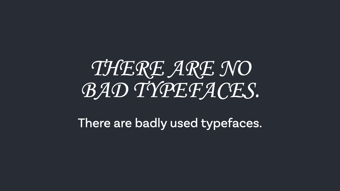
There are no “bad” typeface
For outsiders picking a typeface can seem very mysterious or random. But it’s not – like everything else in a design process it’s about gathering information and making the best decision regarding the circumstances. But let’s kick off things by claiming that there are no bad typefaces. There are badly used typefaces.
Actually this is not true – of courser there are fonts that are not drawn well, with awful kerning and missing characters – in German we can tell you a thing or two about missing umlauts (ä, ö, ü) or sharp S (ß). But let’s say that in most cases the typeface might not be the problem, it might be how it’s used. Is this the right situation for this typeface? Which brings me back to the point from the last article font follow function. What function should it follow? What kinds of text are there anyway?
The different kinds of text
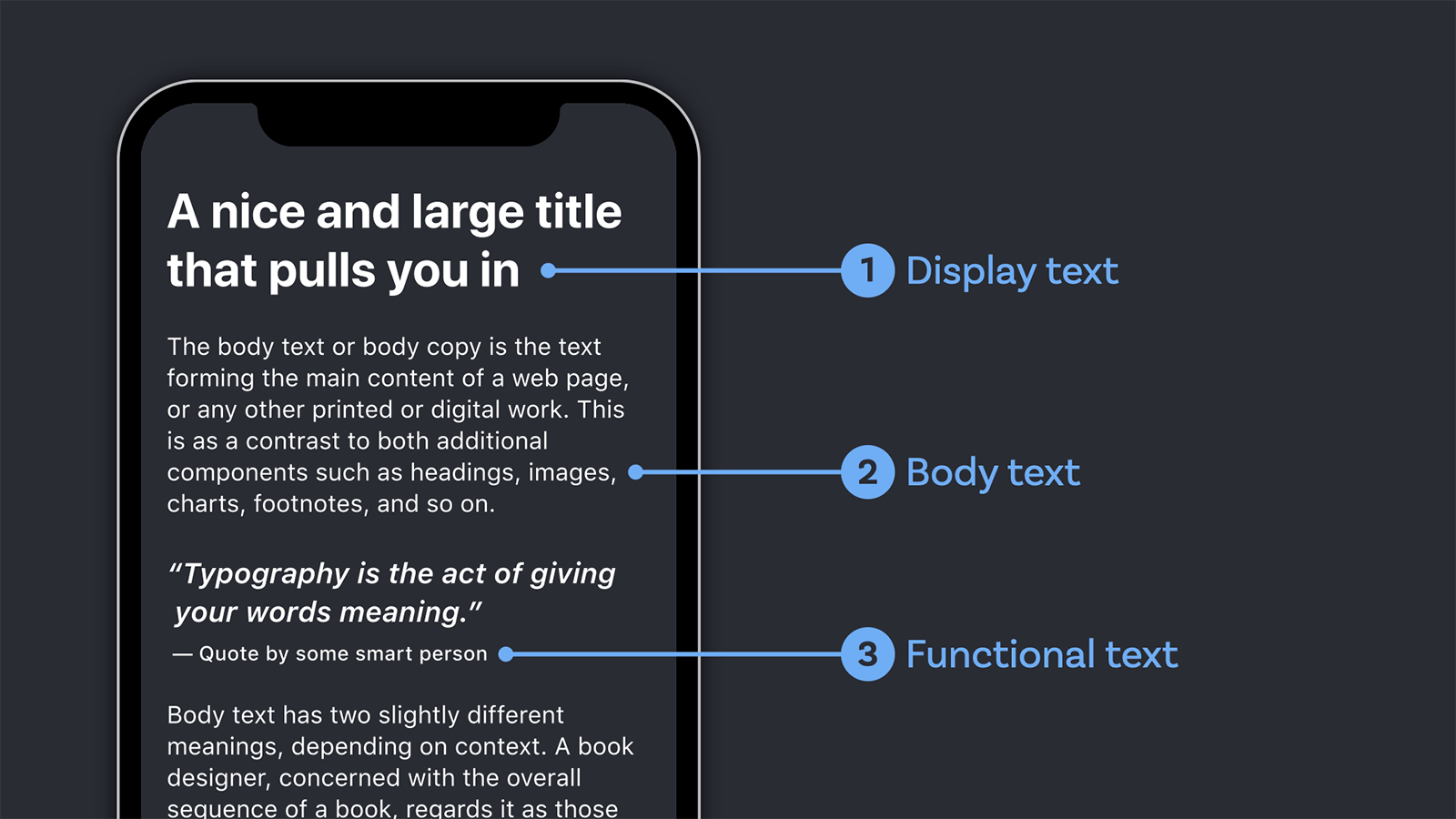
1. Display text
Display text is short text in lager sizes, e.g. for a title, headlines or pull quotes. You should set it in 20 px (or 1.25 rem) and above. The typefaces to choose for this kind of text can be more striking. Use display fonts to show the vibe of your project and attract your reader. Here you find more about how to choose a font for display text.
2. Body text
Body text it the main part of text for long reading content. It should work in regular sizes like 16 px (or 1 rem). A good typeface for body text appears understated. It does not draw much attention to itself and lets the content speak. This is crucial when designing for long reading formats like news websites or blogs, but also a “regular” website with only short paragraphs benefits from solid body text. In this video you find more about how to choose a typeface for body text.
3. Functional text
Functional text is not just a nice way to say everything else. This is the kind of text for user interfaces, navigational elements, labels inside notifications, captions or text on info graphics and charts. It has to work in very small sizes from 11 px to 14 px. Picking a typeface with a consistent stroke and highly distinct characters is important here. Here you find out more about how to pick a font for your UI or app design.
Three question to guide you through the process
Now you know what different categories of text there are. But how do you find out for what text you should optimize the choice of your typeface? I do this by asking myself the following three questions.
1. What is the key application?
This will identify on what type of text you should focus your attention – body text, display text for functional text. If it’s an app the spotlight is on functional text which you could combine it with a nice display text for titles and big headlines. Or it’s a news website, then focus on body text. Maybe it’s a website for an event with very short and little text, then display text needs most of your attention here.
2. Who is the key audience?
What kind of people are they? In what circumstances will they most likely use the product or service? On what device? This all comes into consideration combined with the previous question.
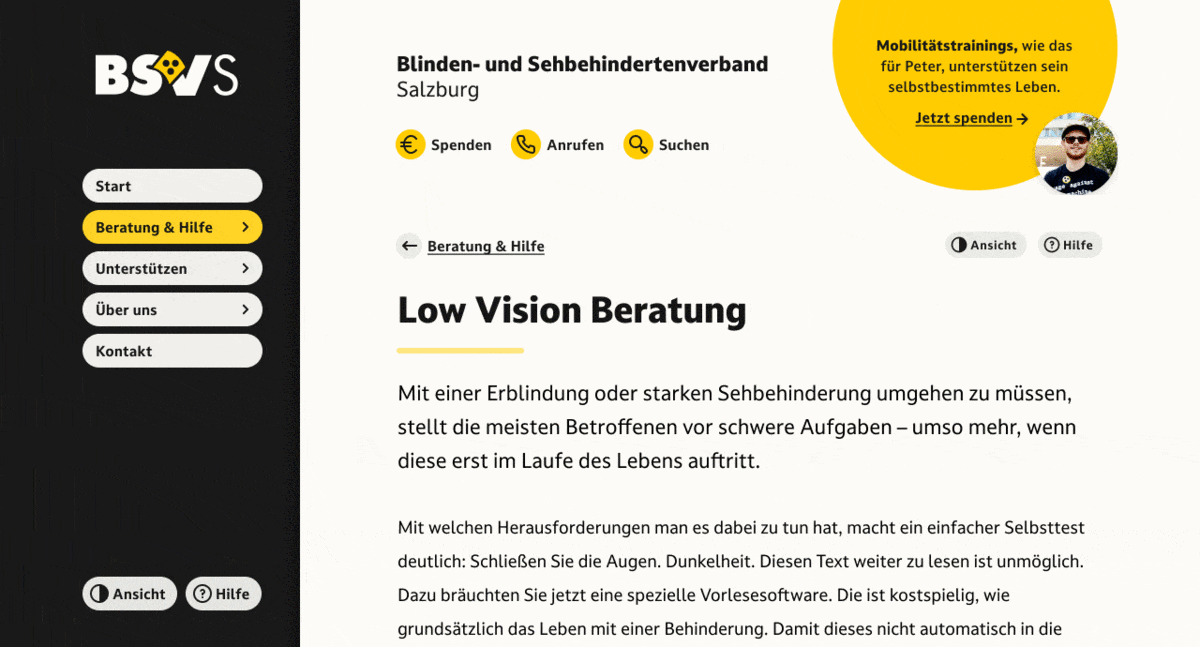
An example; accessibility is always important, but it was even more when I did a web design for an association of the blind in Austria. It was mainly focused around body text and the typeface had to work well on light and dark background, so I chose the typeface Darkmode, that is specifically made for these situations (by the way – Darkmode was also on my FontFriday font recommendation list).
3. What limitations are there?
Are there any brand requirements you have to meet? Do they apply and work well in this particular project? In most cases I work in there are guidelines and corporate typefaces defined, and they rarely fit the needs of a digital project since the are made for print applications. In this situation you have two options: You could use the corporate typeface for display text (which mostly works) and combine it with a solid alternative for body and functional text. Or you could look for a typeface that’s similar but works better on screen.
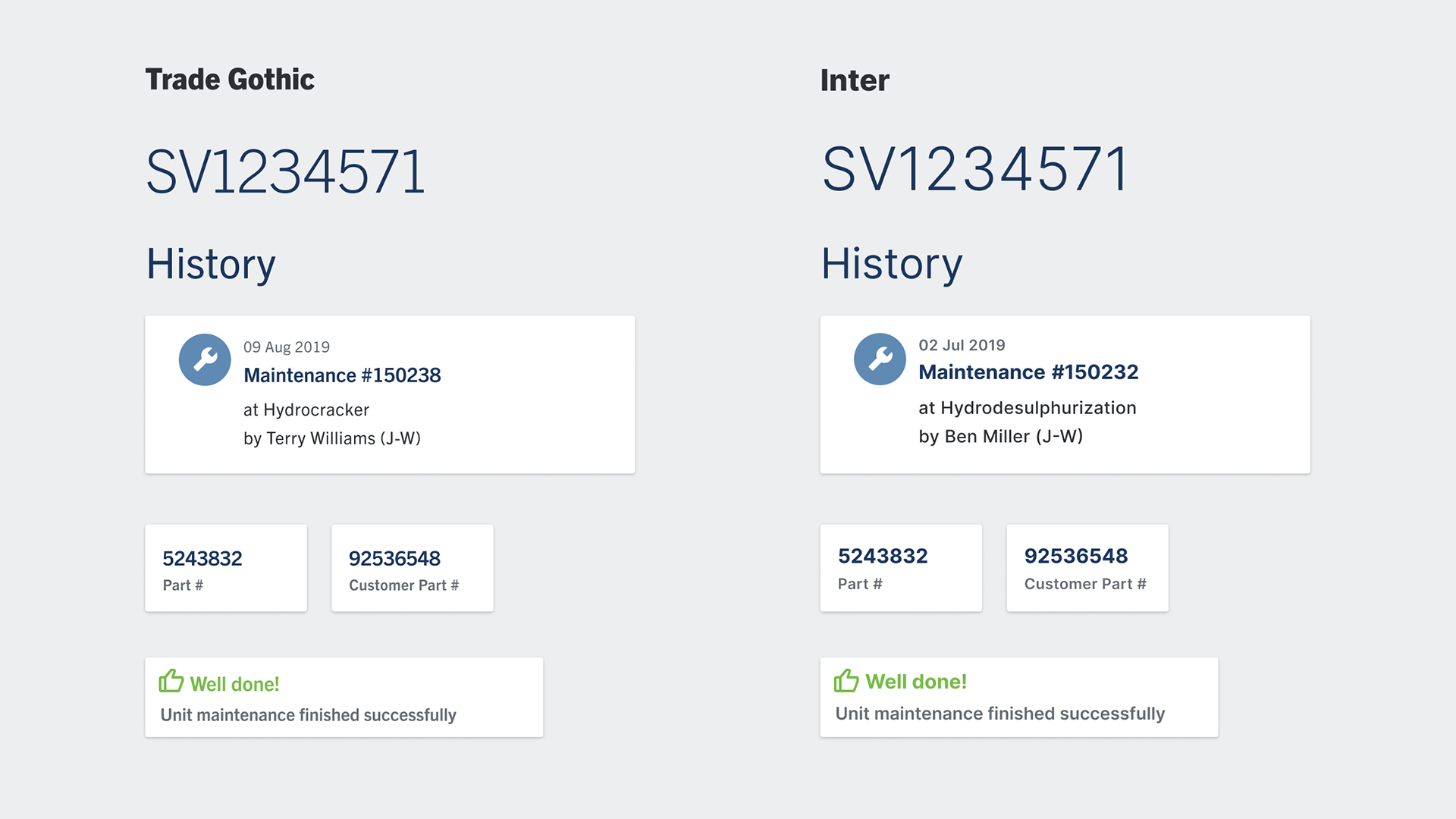
For an app design the brand guidelines suggested to use Trade Gothic, a sans-serif typeface rooted in the 1940s that does not perform well in small sizes, thus makes it inappropriate for functional text. So as an alternative I picked Inter, which is designed for user interfaces. I made a comparison for the client to show them that it is alike but performs much better.
Also ask if there is an allocated budget for licensing a typeface? You as a designer should strive for this and convince your client that it pays off investing in distinctive typography. But if it’s not the case you will have to work with this limitation and look for free fonts (check out my list of sources of free quality fonts).
In these articles and videos I cover what you should consider when picking a font for display text, body text or functional text, so your content can show its best. And also how Font Follows Function – the best alteration ever, right?
I’m curious, what questions do you ask when picking a typeface? Write them in the comments below or shoot me an email!
Hallo Oliver,
super Artikel der mir gerade Licht gebracht hat! Habe die Wahl meiner Schriftarten bisher immer eher “aus dem Bauch heraus” getroffen. Das erklärt also, warum ich beim zweiten Hinsehen dann “OmG” -Effekt hatte! Deine Methode ist viel zielführender und vor allem immer mit den gleichen Ausgangspunkten anwendbar! Super Tipp, danke!
Danke für dein Feedback, Torsten! Ich habe ja auch viel aus dem Bauch heraus entschieden und dann immer wieder gemerkt, dass das dann nicht so gut funktioniert. Im Zuge der Videos habe ich jetzt mal versucht das auch für mich zu formalisieren und klarer zu machen. Schön, dass es dir weiter hilft!